This past weekend for Easter I took a photo of my daughter that I just loved. I knew immediately that I wanted to blow it up and give it extra attention in my Project Life album. Rather than just slip it in a page protector as a stand-alone photo, I decided to create this quick 6x12 layout. I'll slide it in a page protector, as an insert between the left and right pages of the week.
Here's the finished product...
To create the layout I just grabbed a piece of white textured cardstock, my March Citrus Twist Pocket Life kit, a few leftover Maggie Holmes Bloom ephemera pieces, and a strip of patterned paper, also from the Bloom collection, and a glitter wood piece from Heidi Swapp.
I started the layout by trimming my cardstock to 6x12 and adding some ink splatter in grey and gold. Along the right side of the cardstock I added a piece strip of patterned paper (folded over the edge) and stitched in place. I then added the photo, which I had printed 5"x5". Tucked under the top left and bottom right of the photo, I added a small piece of patterned paper. These were actually border/binding strips from the 6x6 papers included in the Pocket Life kit. I love that I got a use out of what could otherwise be garbage!
Along the bottom of the photo I also added a large die cut flower and heart from the ephemera pack, along with the glitter wood title "happy" which is from Heidi Swapp.
Along the top of the photo, I added another scrap border piece of patterned paper and the "Love You" die cut from the ephemera pack, stitched in place. I also added a mini pink glitter heart from the alpha sheet included in the kit.
I added a similar pairing of border strips, along with the stamped date, along the top edge of the page.
And that's it! I'm loving the 6x12 layout size, I will definately be doing more of these, to include in my Project Life albums!
I'll be back soon to share the rest of the Project Life layout that this will be tucked into.
Hi all. I'm back today with my 2nd layout in the "Collection Challenge" series I'm doing with my friend Michelle. As we did before, we each created a Project Life layout using the same collection, to share with you how our 2 different styles can utilize the same product. Today's collection of choice is Dear Lizzy's Documentary.
I went back a few weeks here, to use the collection for week 1. I had skipped over this week (though not for any particular reason), so I just recently backtracked to get it done, and... I'm caught up again. Yay!
I received half of a 6x6 pad of this collection in the Citrus Twist Pocket Life kit from November 2015, so I used a few other elements from that kit as well. I set the alpha stickers that came with the kit aside because, although that are very pretty, I had 2 sets of newly purchased Thickers that were on top of my desk and I just really wanted to use them! ;)
Without further ado, here is the full layout...
And a close-up of the left page...
I loved the floral pattern in the set, and decided to use it for my title card this week. The coral in that pattern became an accent color for the full layout.
The "January" card is from Elle's Sudio. The green striped card was simple. I just cut a 3x4 piece from one of the 6x6 papers, added a stamped sentiment and small puffy heart. I love simple filler cards like that.
This card below ended up being a favorite for the week. It includes collage photo of my daughter celebrating the new year, with just a small cluster of enamel dots and more of the gold Thickers. The coral chipboard piece is from an old Studio Calico kit. The color was perfect, so I had to bring those in too.
Here's a close-up of the right side page...
And a few of my favorite cards from this side...
I used several of the journal cards included in the kit for this layout and added subtle gray ink splatter to a some. To the card of the left, as well as the 3rd card that documents my husband's 41st birthday, I punched a the "This" and "You" circles from the cut-apart sheet of the kit and layered them puffy hearts and washi.
And that's pretty much it. Before I leave you, here are the 2 Thickers that I used on this layout, in case you were interested. They are both gorgeous!
Don't forget to stop over to Michelle's blog today, to see her layout using the same Dear Lizzy collection!
Let me start today's post by saying this Project Life layout was a challenge for me! The layout's color scheme uses PRIMARY colors, which is not really my comfort zone. In fact, I'm generally drawn to any color combo EXCEPT for primary colors! So how did I get myself here???
Well... every year I join other members of my architectural firm for an event called CANstruction. Esentially, we build large models out of canned goods, which become an exhibit at the New York State Museum for a few weeks, after which the models are disassembled and the food donated to the regional food bank. It's a fun event for a worthwhile cause. The brochure for the event is always a fun piece of ephemera I like to include and I've found its easier to work WITH the color scheme rather than ignore it. My problem with this year's brochure was that is is all PRIMARY colors! So I did some shopping and found the "Let's Party" collection from Simple Stories. As a bonus, it's birthay-themed which worked for some birthday celebrations this week.
Here is the brochure (rack card) that I based my color scheme around. This becomes part of an insert I'll share in a bit...
This is the overall layout, of my self-imposed "Primary Colors Challenge" without the insert...
And a close-up of the left side...
In an effort to keep the primary colors under control, I tried to balance out the layout with a lot of neutral colors- particularly cream and gray.
I also utilized a bunch of the circle die cuts from the collection throughout the layout, to echo the circles in the title of the brochure.
To help organize the multiple photos of the building process, I used bright red puffy numbers from Studio Calico, and sequentially numbered the photos...
Here's the front of the insert, which includes the brochure. I used an 8"x8" page protector from Becky Higgins, that is divided into (4) 4" pockets. The brochure slips in the bottom right pocket.
I of course added a tab to the side of the insert. This tab is a sticker from Freckled Fawn, with a sentiment I stamped on.
The back side of the insert includes the back of the brochure, along with a photo and journalling spot about a visit to the Mystery Room.
And here is the full right side of the layout...
You can see lots of the cream and gray here, which really helps to tone down all the primary colors.
I like to document bits of our lives that reflect Pop Culture and our interests at the current time. Things like the TV shows we watch, books we read and music we listen to. I recently asked my daughter to give me a screenshot of her itunes playlist, and so that made it into the layout this week. The acrylic "Playlist" piece is from ColorCast Designs.
And finally, one last card to share with you today. This is a split 4x6 spot, using a filler card from Simple Stories, along with another stitched die-cut circle aside a photo of my brother from his birthday celebration. The text strips I cut from a piece of paper in the collection.
And that's it for today. If I can film a Flip-Thru video in the near future I'll come back and add the link.
I'd love to hear from you... do you find primary colors a challenge too???
Today I am sharing my Project Life layout from last week, using the Hip Kit Club March kits. This is my 2nd layout using these kits, and I’m amazed at how different I was able to make each layout feel, while using contents of the same kit. This week I focused on the brighter colors in the kit, especially the bright pink, yellow and green, along with a bit of navy blue. It’s such a contrast to the previous week that used a lot of the paler tones in the kit.
This week also includes an insert which I’ll share in a bit, but first, here’s the overall layout without the insert…
And a close-up of the left page…
I love the exclusive journal cards provided in the Project Life kit, and utilized quite a few of them throughout the layout. My title card was created by fussy cutting the “Hello March” text from one of the cards.
I love that bright yellow triangle journal card, which was provided in the kit. Triangles definitely became a re-occurring theme in this layout.
Here’s a close-up of the right side page…
And a few of the cards from this side of the layout…
I just LOVE the Pinkfresh silver glitter words that were included in the embellishment kit. The foam under the glitter is bright pink and they are just BEAUTIFUL in person! To bring in some other silver glitter elements, I hole-punched dots from glitter washi tape I had in my stash, and placed them in clusters alongside some of the Basic Grey enamel dots that were provided in the kit.
This card features a new acrylic piece from Color Cast Designs. The color and text was perfect for this layout, as I wanted to journal the story of my daughter’s new found interest in Star Wars.
And now for the insert…
It occurred to me that in addition to Star Wars, there were a few “throwback” things that were a part of our lives this week. I chose to document these on the front side of a smaller pocket page insert- First, the series premier of Fuller House was so highly anticipated, I had to document it! Then comes Taylor’s new interest in the music of Michael Jackson… not sure where that came from??? Lastly, a TV series about the O.J. Simpson trial that I have been watching.
To document these 3 things, I trimmed down a page protector with 3”x3” pockets and assigned each “throwback” event a row. The triangles in the throwback title were cut from one of the filler cards in the kit and just stitched in place. To pick up on the triangles throughout the layout, I decided to dig out my Fuse tool and make some triangular pockets. I first filled a few with some acrylic confetti, backed with vellum.
I filled each confetti pocket with a combination of ADORABLE ampersand confetti from Colorcast Designs, and some mini triangle wood veneer from my stash. One of the pockets also has a larger ampersand from the Elle’s Studio pack that was included in the Hip Kit. I misted all the wood veneer a gray color before adding it. To the outside of each confetti pocket, I adhered an acrylic disc from ColorCast. Each one has a saying- “The Good,” “The Bad” & “The Ugly” which I thought was a fitting way to describe each of these throwback events!
I of course had to add a tab to the insert, to help it stand out from the page below. This tab is from the Pinkfresh diecut pack in the embellishment kit, I just added a bit of washi to it before stapling in place.
The back of the insert is pretty simple, just documenting a trip we took to the New York State Museum on Sunday…
And here is how the insert looks in my album…
Well... that's it for today. Below is a quick YouTube flip through video. Thanks for stopping by!
Today I'll be sharing a layout using Hip Kit Club kits from March. This layout features the paler tones in the kit. I love the color combo of pink, peach and green. Feels like Spring!
This layout has a few inserts which I'll share later. First, here is the overall layout...
And a close-up of the left page...
I love the Pinkfresh vellum alpha included in the Project Life kit. Because they are transparent, you can see the pattern of the paper below. I especially loved the way they look on the title card, where the outline of the floral pattern shows through.
And the right page...
I used several pieces of the Elle's Studio die cuts and wood veneer sprinkled throughout the layout. It's hard to see in the photos, but I added a peach colored spray ink to the wood veneer to tie them to the color scheme a bit more.
The tag on the lower right card I made by trimming and layering a few pieces from the Elle's Studio die-cut pack, and then stitching them together.
And last but certainly not least, here are the inserts for this week. The 1st is an envelope I made using that gorgeous Pinkfresh gold foil paper.
The envelope holds a poem my daughter wrote in school. It wasn't something she would want visible for everyone to read, but I like to include bits and pieces of her schoolwork, so tucking it in an envelope was the perfect way to include it. I've added a tutorial video for how to make the envelope at the end of this post.
The 2nd insert documents my typical Saturday routine. I love the Project Life format because it allows me to document all the everyday bits of life that we'll want to look back on someday.
To make this insert I just typed up my schedule and printed it on white cardstock and added some patterned paper and washi along the top and bottom. I trimmed the insert to about 5" wide, and inserted it into a trimmed 12x12 page protector. To seal up the sides I stitched a piece of the gold foil vellum down the outside cut edge, along with a bright yellow tag from the Pinkfresh die-cut pack from the embellishment kit. The "Daily Life" I added with a mini phrase stamp from my collection.
The finishing touch of this insert is the title. The "My Life" embellishment is an acrylic piece from Color Cast Design's March release. I backed the larger letters with scraps of patterned paper.
Here is how the 2 inserts look in the album...
And that's about it. I'm excited to dig in to the rest of the March Hip Kit for another layout!
Please feel free to leave a comment, I really love to hear from readers!
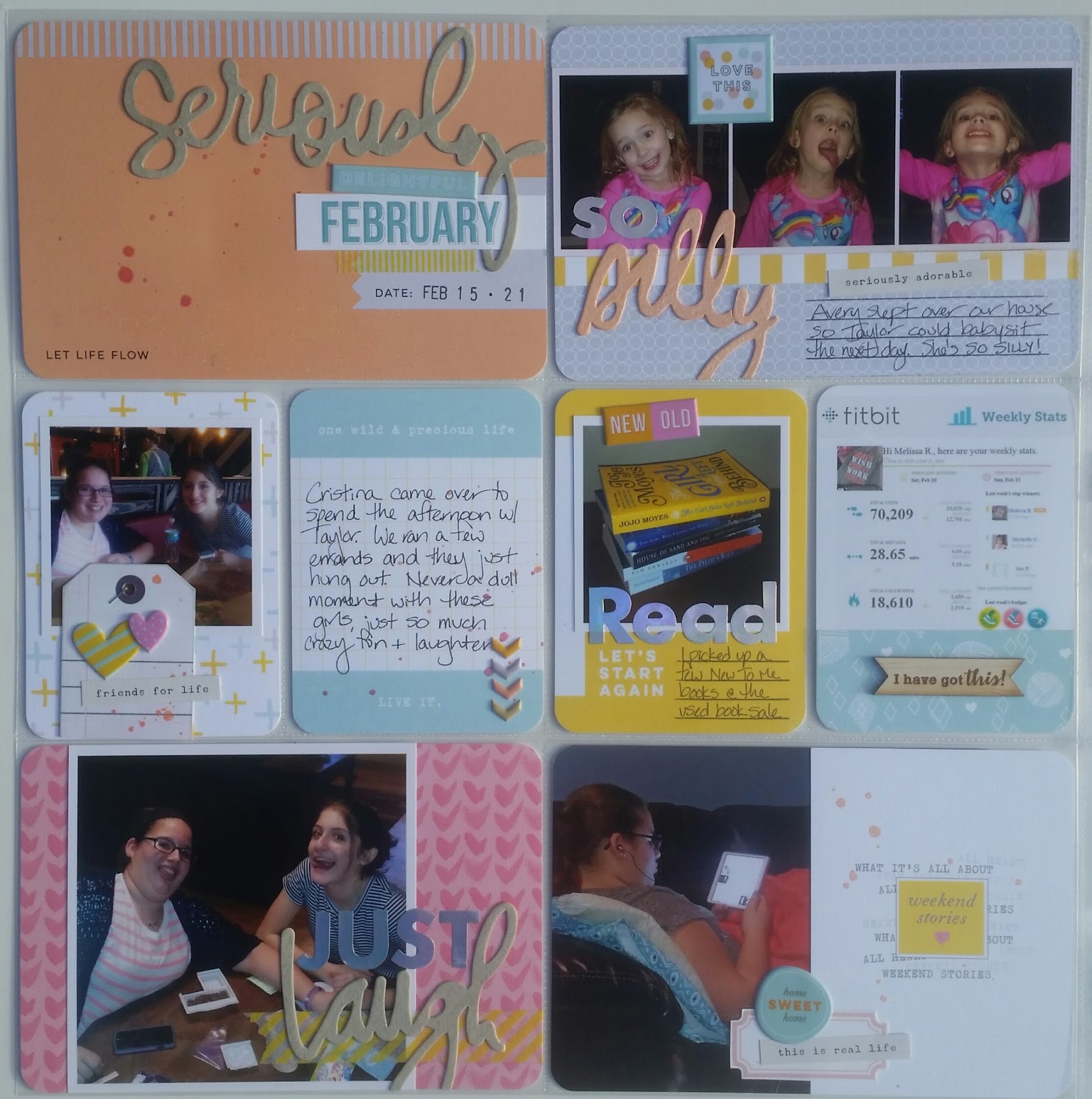
Today's layout was a pleasant surprise. I used the Citrus Twist February Pocket Life kit "Stories" which I wasn't sure about at first. I loved the colors, but it felt a bit bright and summer-y and I just wasn't sure how it would work for a February layout. I almost set it aside for a few months and then just decided to go for it. The colors ended up tying together the colors in many of the photographs and I'm happy to say, I'm thrilled with how the layout turned out!
Here is the full layout...
And a close-up of the left page...
Stay tuned at the end of this post, and I'll share a bit about the "silly" script piece in that card.
I would be hard pressed to choose a favorite component to this kit. Those iridescent alpha stickers from Studio Calico are gorgeous! I don't think the photos do them justice. They are silver, but look pink and blue as the light hits them. Another kit favorite is the set of puffy stickers from Pinkfresh. The colors are just Sherbert-y delicious!!! The little wood veneer banner on the FitBit card is from Color Cast Designs and added from my stash.
Here is the full right side...
And a few of my favorite cards...
The pink "this" card was from the cut-apart sheet Citrus Twist provided in the kit. I love those sheets, I can always find something useful on them!
I clustered a handful of acrylic stars to add a bit of dimension and color to this journal card. The smaller ones are from ColorCast Designs. The larger pink ones are from an older Citrus Twist kit from December. The "Memories" acrylic and wood veneer banner on this page are also from ColorCast.
Before I leave you, I'll share a quick bit about that "Silly" script piece I mentioned. The kit came with 4 script words from Heidi Swapp. I used the words "seriously" and "laugh" elsewhere on the layout, but was then left with "silliness" and "bonjour" which just weren't quite right for the cards I had left to embellish. I was thinking that I wished one just said "silly" and then realized I could do some paper surgery and make it! I noticed the middle of the "bonjour" looked like a 'y' so I cut it out, along with the 'sill' of of "silliness" and voila! I was able to make a word that worked for a card about the silly faces my niece makes. The words are cut from watercolor paper so I misted them all before adding to the layout.
Again, here's the left side of the layout where you can see all 3 words...
Thanks for stopping by, please feel free to add a comment, I love to read them!