Today I'll be sharing a layout using Hip Kit Club kits from March. This layout features the paler tones in the kit. I love the color combo of pink, peach and green. Feels like Spring!
This layout has a few inserts which I'll share later. First, here is the overall layout...
And a close-up of the left page...
I love the Pinkfresh vellum alpha included in the Project Life kit. Because they are transparent, you can see the pattern of the paper below. I especially loved the way they look on the title card, where the outline of the floral pattern shows through.
And the right page...
I used several pieces of the Elle's Studio die cuts and wood veneer sprinkled throughout the layout. It's hard to see in the photos, but I added a peach colored spray ink to the wood veneer to tie them to the color scheme a bit more.
The tag on the lower right card I made by trimming and layering a few pieces from the Elle's Studio die-cut pack, and then stitching them together.
And last but certainly not least, here are the inserts for this week. The 1st is an envelope I made using that gorgeous Pinkfresh gold foil paper.
The envelope holds a poem my daughter wrote in school. It wasn't something she would want visible for everyone to read, but I like to include bits and pieces of her schoolwork, so tucking it in an envelope was the perfect way to include it. I've added a tutorial video for how to make the envelope at the end of this post.
The 2nd insert documents my typical Saturday routine. I love the Project Life format because it allows me to document all the everyday bits of life that we'll want to look back on someday.
To make this insert I just typed up my schedule and printed it on white cardstock and added some patterned paper and washi along the top and bottom. I trimmed the insert to about 5" wide, and inserted it into a trimmed 12x12 page protector. To seal up the sides I stitched a piece of the gold foil vellum down the outside cut edge, along with a bright yellow tag from the Pinkfresh die-cut pack from the embellishment kit. The "Daily Life" I added with a mini phrase stamp from my collection.
The finishing touch of this insert is the title. The "My Life" embellishment is an acrylic piece from Color Cast Design's March release. I backed the larger letters with scraps of patterned paper.
Here is how the 2 inserts look in the album...
And that's about it. I'm excited to dig in to the rest of the March Hip Kit for another layout!
Please feel free to leave a comment, I really love to hear from readers!
Friday, March 18, 2016
Wednesday, March 16, 2016
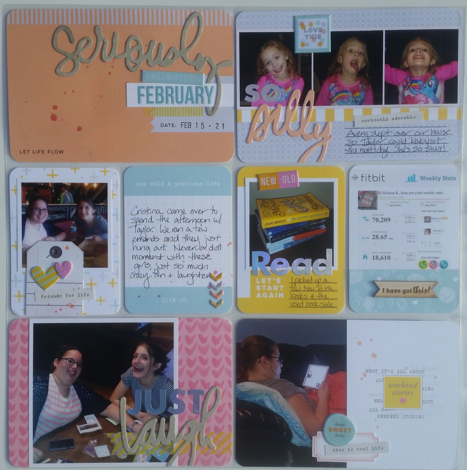
Project Life 2016 | February 15-21
Today's layout was a pleasant surprise. I used the Citrus Twist February Pocket Life kit "Stories" which I wasn't sure about at first. I loved the colors, but it felt a bit bright and summer-y and I just wasn't sure how it would work for a February layout. I almost set it aside for a few months and then just decided to go for it. The colors ended up tying together the colors in many of the photographs and I'm happy to say, I'm thrilled with how the layout turned out!
Here is the full layout...
And a close-up of the left page...
Stay tuned at the end of this post, and I'll share a bit about the "silly" script piece in that card.
I would be hard pressed to choose a favorite component to this kit. Those iridescent alpha stickers from Studio Calico are gorgeous! I don't think the photos do them justice. They are silver, but look pink and blue as the light hits them. Another kit favorite is the set of puffy stickers from Pinkfresh. The colors are just Sherbert-y delicious!!! The little wood veneer banner on the FitBit card is from Color Cast Designs and added from my stash.
Here is the full right side...
And a few of my favorite cards...
The pink "this" card was from the cut-apart sheet Citrus Twist provided in the kit. I love those sheets, I can always find something useful on them!
I clustered a handful of acrylic stars to add a bit of dimension and color to this journal card. The smaller ones are from ColorCast Designs. The larger pink ones are from an older Citrus Twist kit from December. The "Memories" acrylic and wood veneer banner on this page are also from ColorCast.
Before I leave you, I'll share a quick bit about that "Silly" script piece I mentioned. The kit came with 4 script words from Heidi Swapp. I used the words "seriously" and "laugh" elsewhere on the layout, but was then left with "silliness" and "bonjour" which just weren't quite right for the cards I had left to embellish. I was thinking that I wished one just said "silly" and then realized I could do some paper surgery and make it! I noticed the middle of the "bonjour" looked like a 'y' so I cut it out, along with the 'sill' of of "silliness" and voila! I was able to make a word that worked for a card about the silly faces my niece makes. The words are cut from watercolor paper so I misted them all before adding to the layout.
Again, here's the left side of the layout where you can see all 3 words...
Thanks for stopping by, please feel free to add a comment, I love to read them!
Here is the full layout...
And a close-up of the left page...
Stay tuned at the end of this post, and I'll share a bit about the "silly" script piece in that card.
I would be hard pressed to choose a favorite component to this kit. Those iridescent alpha stickers from Studio Calico are gorgeous! I don't think the photos do them justice. They are silver, but look pink and blue as the light hits them. Another kit favorite is the set of puffy stickers from Pinkfresh. The colors are just Sherbert-y delicious!!! The little wood veneer banner on the FitBit card is from Color Cast Designs and added from my stash.
Here is the full right side...
And a few of my favorite cards...
The pink "this" card was from the cut-apart sheet Citrus Twist provided in the kit. I love those sheets, I can always find something useful on them!
I clustered a handful of acrylic stars to add a bit of dimension and color to this journal card. The smaller ones are from ColorCast Designs. The larger pink ones are from an older Citrus Twist kit from December. The "Memories" acrylic and wood veneer banner on this page are also from ColorCast.
Before I leave you, I'll share a quick bit about that "Silly" script piece I mentioned. The kit came with 4 script words from Heidi Swapp. I used the words "seriously" and "laugh" elsewhere on the layout, but was then left with "silliness" and "bonjour" which just weren't quite right for the cards I had left to embellish. I was thinking that I wished one just said "silly" and then realized I could do some paper surgery and make it! I noticed the middle of the "bonjour" looked like a 'y' so I cut it out, along with the 'sill' of of "silliness" and voila! I was able to make a word that worked for a card about the silly faces my niece makes. The words are cut from watercolor paper so I misted them all before adding to the layout.
Again, here's the left side of the layout where you can see all 3 words...
Thanks for stopping by, please feel free to add a comment, I love to read them!
Monday, March 14, 2016
Project Life 2016 | January 11-24
Today I'm sharing a simple layout from January that I pulled together using a few random things including papers from Pink Paislee's "C'est La Vie" collection and and the Citrus Twist embellishment add-on kit from February. The add-on kit included puffy stickers from Pink Paislee and rubber pieces & a washi book from the Maggie Holmes Bloom collection. I also added in a few miscellaneous Heidi Swapp pieces, and a handful of paper scraps from my stash to pull the color pallete together.
Here's the overall spread...
A close-up of the left page...
And the right page...
I made a couple of very simple pockets for this layout, to hold some different ephemera I had saved. First, a pocket for a set of ticket stubs from a hockey game. We get a LOT of these over the course of a season, so it's nice to include them every now and them.
The second pocket in this layout holds a pair of (losing!) Powerball lottery tickets. This was such a topic of conversation this week, I had to include them! The mint green and gold tab is from Heidi Swapp's planner collection.
The alpha stickers used throughout are from Bo Bunny. I love the font and size, and 3 colors come on a single 12x2 sheet! This sheet has white, black and grey.
And finally, a reminder that sometimes the simplest cards can be... wonderful.
That's about it today- Short and sweet. Not every layout is a detailed masterpiece, and that's okay!
Here's the overall spread...
A close-up of the left page...
And the right page...
I made a couple of very simple pockets for this layout, to hold some different ephemera I had saved. First, a pocket for a set of ticket stubs from a hockey game. We get a LOT of these over the course of a season, so it's nice to include them every now and them.
The second pocket in this layout holds a pair of (losing!) Powerball lottery tickets. This was such a topic of conversation this week, I had to include them! The mint green and gold tab is from Heidi Swapp's planner collection.
The alpha stickers used throughout are from Bo Bunny. I love the font and size, and 3 colors come on a single 12x2 sheet! This sheet has white, black and grey.
And finally, a reminder that sometimes the simplest cards can be... wonderful.
That's about it today- Short and sweet. Not every layout is a detailed masterpiece, and that's okay!
Saturday, March 12, 2016
Project Life 2016 | February 8-14
Happy weekend everyone!!!! I'm headed to a crop with my girlfriends today, but first wanted to share a recent Project Life layout. Today's layout uses pieces from the January 2016 Hip Kit Club Project Life & paper add-on kits. I loved the pairing of the My Minds Eye “My Story” and Crate Paper “Hello Love” collections, such pretty colors!
Here's the overall spread:
And a close-up of the left page:
For my title card this week, I started by cutting a 4x6 from the gorgeous ombre paper and added a bit of teal ink splatter. The acrylic “hello” piece is from Color Cast Design’s February release. I love the script font of this piece, and the color was perfect to help highlight the aqua and teal throughout the layout. The “love” tag is cut from a sheet of the Crate Paper collection I had previously bought. I just added an eyelet and twine, strip of washi and then hand stitched a bit along the bottom. I kept it pretty simple, as I wanted to still see the ombre of the base paper.
This "lunch" card ended up being one of my favorites this week. Not sure why. I love the little wood veneer alpha provided in the kit, but didn't love the raw woodgrain color for this spread, so I colored them with black ink. This card documents a new favorite lunch spot I discovered, highlighted with those letters to spell "lunch." On the left side of the spread you'll see I spelled out "Dinner" with the same wood veneer alpha. I like how those 2 words on opposite pages provided balance to the full layout.
Here is the full right side:

I cut this 4x6 card from the larger 12x12 paper in the paper add-on, added more teal ink splatter and hand stitched along the XOXO and arrow. I don’t often include a full 4x6 pocket without a photo of some sort, but this ended up being a great filler card to direct attention to a family photo in the pocket to the right.
The "xoxo" tag I tucked under this photo was from a pack I found in the dollar spot at Target. I thought the we're so cute! Again, I just added a bit of washi and some hand stitching.
This colorful filler card here was cut from that busy patterned paper included in the paper add-on. I loved the mix of colors and patterns and thought it would be great to tie all the colors in this layout together. I tried to keep it as un-interupted as possible, with just a small bit of journalling and the large "10K" using the Heidi Swapp puffy numbers. The tag card on the right was made using 2 pieces from the My Minds Eye journal card pack. I liked the "today" frame, but trimmed it to square the corners and thin the sides a bit. Tags definately seemed to be a repetitive theme this week!
And that's pretty much it for this layout. I'm off to hang with the girls. Have a great weekend everyone!
Here's the overall spread:
And a close-up of the left page:
For my title card this week, I started by cutting a 4x6 from the gorgeous ombre paper and added a bit of teal ink splatter. The acrylic “hello” piece is from Color Cast Design’s February release. I love the script font of this piece, and the color was perfect to help highlight the aqua and teal throughout the layout. The “love” tag is cut from a sheet of the Crate Paper collection I had previously bought. I just added an eyelet and twine, strip of washi and then hand stitched a bit along the bottom. I kept it pretty simple, as I wanted to still see the ombre of the base paper.
This "lunch" card ended up being one of my favorites this week. Not sure why. I love the little wood veneer alpha provided in the kit, but didn't love the raw woodgrain color for this spread, so I colored them with black ink. This card documents a new favorite lunch spot I discovered, highlighted with those letters to spell "lunch." On the left side of the spread you'll see I spelled out "Dinner" with the same wood veneer alpha. I like how those 2 words on opposite pages provided balance to the full layout.
Here is the full right side:

I cut this 4x6 card from the larger 12x12 paper in the paper add-on, added more teal ink splatter and hand stitched along the XOXO and arrow. I don’t often include a full 4x6 pocket without a photo of some sort, but this ended up being a great filler card to direct attention to a family photo in the pocket to the right.
The "xoxo" tag I tucked under this photo was from a pack I found in the dollar spot at Target. I thought the we're so cute! Again, I just added a bit of washi and some hand stitching.
This colorful filler card here was cut from that busy patterned paper included in the paper add-on. I loved the mix of colors and patterns and thought it would be great to tie all the colors in this layout together. I tried to keep it as un-interupted as possible, with just a small bit of journalling and the large "10K" using the Heidi Swapp puffy numbers. The tag card on the right was made using 2 pieces from the My Minds Eye journal card pack. I liked the "today" frame, but trimmed it to square the corners and thin the sides a bit. Tags definately seemed to be a repetitive theme this week!
And that's pretty much it for this layout. I'm off to hang with the girls. Have a great weekend everyone!
Thursday, March 10, 2016
Collection Challenge- Shine Style!
So my friend Michelle and I were talking recently about liking the same collections, even though our styles are pretty different... and she had the brilliant idea to have a little "challenge" of sorts. We'd each create a Project Life spread using the same collection as a base, and then share what we each did. Its fun to see how versatile some of these collections are! So without further ado, I present to you, our Collection Challenge using the Maggie Holmes "Shine" collection.
To create my layout, I actually used the January 2016 Citrus Twist Project Life kit “Verona.” It included half a 6x6 pad from the Shine collection, which I used as a base throughout the spread. I love the look of this collection, but it is very “eclectic” feeling which was a bit of a challenge for those of us that like a definitive color palette or theme.
Here is the overall spread:
And a close-up of the left side:
I loved the “Pure Joy” journal card that came in the kit, but the white lettering was hard to see, so I hand traced with a black journaling pen to help it stand out. I added some gold ink platter on the card to add a little shimmer and tie in the gold accents scatters throughout the layout before adding my journalling along the bottom. The title card I kept VERY simple for this layout as I just love that floral paper and didn't want to distract from it at all.
I loved the Pinkfresh puffy stickers that came in the kit, especially the little chevron shapes. I used a few of them to create an “arrow” of sorts, on a Citrus Twist journal card, along with a little ink splatter. This card documented a trip to an urgent care center to get x-rays of Taylor’s arm, which fortunately was not broken and just sprained.
This spread included an insert. I trimmed down a 3”x3” square page protector (from October Afternoon) and placed in a frame in the center, an acrylic piece from Color Cast Designs (LOVE them!!!). It says “A Better Me” and was perfect for this insert. Since the beginning of the year I’ve been working on improving my health, and trying to lose weight. I don’t normally include this much about myself, but I’m trying to make sure I’m IN these albums, so… this is a start. The front side of the insert is a bit about my journey thus far. Both sides of the insert include some small journal strips that I stamped using words & phrases from Citrus Twist stamp sets. I LOVE those little stamps, they just keep on giving!!!!
The “make it count” stamped phrase was perfect paired with a chipboard heart and the awesome number paper from the Shine collection. And check out the gorgeousness of that acrylic!
The back of the insert has a few smaller photos of some time we spent with family and then commemorates the anniversary of 2 events- my grandfather’s passing and the Challenge shuttle explosion, which I remember watching that live from my elementary school classroom.
Here's a close-up of the full right page:
The November PL kit from Citrus Twist included the ephemera pack from the Shine collection, so I used a few of those leftover pieces in this layout. I especially loved the acetate “LOVE” piece, which was perfect to layer over the paint wash paper along side this photo of my cousin’s adorable daughter. I had also bought the acetate pages from the Shine collection and used a few pieces of that in this layout. The color dots one I plan to leave as a transparent piece to peek through to the following week. I just added a few small Pinkfresh puffy stickers to the card.
The Superbowl card I made myself in Photoshop. The “Sparkle + Shine” card was also from the kit, embellished with some ink splatter and more Pinkfresh puffy stickers.
To check out Michelle's take on this collection, check out her blog www.michelleslittlecreations.com
If you have used this collection and would like to share, please comment with a link to your work, I'd love to see! And let us know if you'd be interested in seeing more Collection Challenges!
To create my layout, I actually used the January 2016 Citrus Twist Project Life kit “Verona.” It included half a 6x6 pad from the Shine collection, which I used as a base throughout the spread. I love the look of this collection, but it is very “eclectic” feeling which was a bit of a challenge for those of us that like a definitive color palette or theme.
Here is the overall spread:
And a close-up of the left side:
I loved the “Pure Joy” journal card that came in the kit, but the white lettering was hard to see, so I hand traced with a black journaling pen to help it stand out. I added some gold ink platter on the card to add a little shimmer and tie in the gold accents scatters throughout the layout before adding my journalling along the bottom. The title card I kept VERY simple for this layout as I just love that floral paper and didn't want to distract from it at all.
I loved the Pinkfresh puffy stickers that came in the kit, especially the little chevron shapes. I used a few of them to create an “arrow” of sorts, on a Citrus Twist journal card, along with a little ink splatter. This card documented a trip to an urgent care center to get x-rays of Taylor’s arm, which fortunately was not broken and just sprained.
This spread included an insert. I trimmed down a 3”x3” square page protector (from October Afternoon) and placed in a frame in the center, an acrylic piece from Color Cast Designs (LOVE them!!!). It says “A Better Me” and was perfect for this insert. Since the beginning of the year I’ve been working on improving my health, and trying to lose weight. I don’t normally include this much about myself, but I’m trying to make sure I’m IN these albums, so… this is a start. The front side of the insert is a bit about my journey thus far. Both sides of the insert include some small journal strips that I stamped using words & phrases from Citrus Twist stamp sets. I LOVE those little stamps, they just keep on giving!!!!
The “make it count” stamped phrase was perfect paired with a chipboard heart and the awesome number paper from the Shine collection. And check out the gorgeousness of that acrylic!
The back of the insert has a few smaller photos of some time we spent with family and then commemorates the anniversary of 2 events- my grandfather’s passing and the Challenge shuttle explosion, which I remember watching that live from my elementary school classroom.
Here's a close-up of the full right page:
The November PL kit from Citrus Twist included the ephemera pack from the Shine collection, so I used a few of those leftover pieces in this layout. I especially loved the acetate “LOVE” piece, which was perfect to layer over the paint wash paper along side this photo of my cousin’s adorable daughter. I had also bought the acetate pages from the Shine collection and used a few pieces of that in this layout. The color dots one I plan to leave as a transparent piece to peek through to the following week. I just added a few small Pinkfresh puffy stickers to the card.
The Superbowl card I made myself in Photoshop. The “Sparkle + Shine” card was also from the kit, embellished with some ink splatter and more Pinkfresh puffy stickers.
To check out Michelle's take on this collection, check out her blog www.michelleslittlecreations.com
If you have used this collection and would like to share, please comment with a link to your work, I'd love to see! And let us know if you'd be interested in seeing more Collection Challenges!
Tuesday, March 8, 2016
Documenting a Vacation in Project Life
One of the questions I see asked frequently is how to incorporate vacations (or big events) into Project Life. I view my Project Life albums as a summary of our lives. It’s the big things (like birthdays and holidays), and the little things (like what we had for dinner or what we watch on TV), and everything in-between. By that theory, I would never want to OMIT a family vacation from our Project Life albums. But… I certainly can’t include EVERY photo I take! So, I include a summary- just enough to give a good picture of our trip. Sometimes I’ll also do a full separate album where I can elaborate on each thing we did, or a few 12x12 layouts to highlight something, but more often than not, my summary in Project Life is just enough.
So here’s how I do it…
Step 1- PLAN
I often start any Project Life layout with a rough plan, so I don’t waste time and money editing and printing photos I won’t use. This is especially the case with a vacation. I could never edit every photo I took- Ain’t nobody got time for that! So I grab some graph paper and sketch out a plan. I use the left side of my standard Design A as the START of my vacation, and the right side as the END of my vacation, and anything I need to add in the middle (an “insert”) is narrower than 12”, so that left and right side act as “bookends” to identify where the vacation starts and stops. With that theory, I plan out my pages, usually 1 page, or a pair of pages, PER DAY. Sorting by day helps keep things organized. We often travel to Disney, and on the occasions we “park hop” within a single day, I might assign each PARK its own spread, as opposed to each DAY.
Step 2- SELECT PHOTOS, EDIT AND PRINT
As I said, I only edit and print photos I intend to use (with a few extras when I can’t make up my mind). Depending on the page protector I want to use, I’ll pick the handful of photos I want to use to “summarize” each day. Usually between 5 and 10 photos. I scribble a short description of the photo in my plan, so I know what I intend to go where. Keeping photos organized by year, month & day really helps this process go smoothly as I’m only sorting though 1 day’s worth of photos at a time. If need be, I break a day up into small portions, like day and evening.
Step 3- INSERT PHOTOS
Once my photos are printed and trimmed, I insert into pockets according to my plan.
Step 4- THE FUN PART
Next comes the fun part- adding patterned paper, journal cards and embellishments. I try to use 1 collection as a “base” for the full vacation, so it feels like 1 cohesive event. Occasionally I’ll give each day its own accent color, to help separate one day from the next.
Using our beach vacation from last year as an example, here's how the pages looked.
The full left page (Friday arrival and Saturday):
Front of 1st insert (rest of Saturday):
Back of 1st insert(Sunday):
Front of 2nd insert(Monday):
Back of 2nd insert(Tuesday):
Full right page (rest of Tuesday):
But wait, theres one more important step...
Step 5- DON’T FORGET THE TABS!
To help the inserts stand out, or to identify each day/event, I always attach a tab to each insert. I often number or label them, again, to help identify one day from the next. Especially for a beach vacation, when all the photos seem to look like 1 REALLY long day. Here’s how they look in this album….
Here's a snippet of some other tabbed inserts for a vacation the previous year:
And the year before that:
I don't ALWAYS label the tabs if I think the journalling cards are clear to identify each day from the next, but I do always add the tabs themselves. I just like how they pop off the base page below. Here's one last snippet, of a couple Disney trips with un-labled tabs.
And that’s pretty much it! I’ve used this method to document our vacations in Project Life for the last 4 or 5 years now, and it seems to work pretty well for me. I use a similar approach for any larger event, such as a few days of Christmas celebrations, or a large birthday party.
I'd love to hear how you include big events in your Project Life!
Subscribe to:
Posts (Atom)