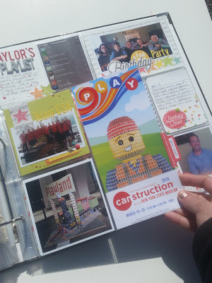
Let me start today's post by saying this Project Life layout was a challenge for me! The layout's color scheme uses PRIMARY colors, which is not really my comfort zone. In fact, I'm generally drawn to any color combo EXCEPT for primary colors! So how did I get myself here???
Well... every year I join other members of my architectural firm for an event called CANstruction. Esentially, we build large models out of canned goods, which become an exhibit at the New York State Museum for a few weeks, after which the models are disassembled and the food donated to the regional food bank. It's a fun event for a worthwhile cause. The brochure for the event is always a fun piece of ephemera I like to include and I've found its easier to work WITH the color scheme rather than ignore it. My problem with this year's brochure was that is is all PRIMARY colors! So I did some shopping and found the "Let's Party" collection from Simple Stories. As a bonus, it's birthay-themed which worked for some birthday celebrations this week.
Here is the brochure (rack card) that I based my color scheme around. This becomes part of an insert I'll share in a bit...
This is the overall layout, of my self-imposed "Primary Colors Challenge" without the insert...
And a close-up of the left side...
In an effort to keep the primary colors under control, I tried to balance out the layout with a lot of neutral colors- particularly cream and gray.
I also utilized a bunch of the circle die cuts from the collection throughout the layout, to echo the circles in the title of the brochure.
To help organize the multiple photos of the building process, I used bright red puffy numbers from Studio Calico, and sequentially numbered the photos...
Here's the front of the insert, which includes the brochure. I used an 8"x8" page protector from Becky Higgins, that is divided into (4) 4" pockets. The brochure slips in the bottom right pocket.
I of course added a tab to the side of the insert. This tab is a sticker from Freckled Fawn, with a sentiment I stamped on.
The back side of the insert includes the back of the brochure, along with a photo and journalling spot about a visit to the Mystery Room.
And here is the full right side of the layout...
You can see lots of the cream and gray here, which really helps to tone down all the primary colors.
I like to document bits of our lives that reflect Pop Culture and our interests at the current time. Things like the TV shows we watch, books we read and music we listen to. I recently asked my daughter to give me a screenshot of her itunes playlist, and so that made it into the layout this week. The acrylic "Playlist" piece is from ColorCast Designs.
And finally, one last card to share with you today. This is a split 4x6 spot, using a filler card from Simple Stories, along with another stitched die-cut circle aside a photo of my brother from his birthday celebration. The text strips I cut from a piece of paper in the collection.
And that's it for today. If I can film a Flip-Thru video in the near future I'll come back and add the link.
I'd love to hear from you... do you find primary colors a challenge too???


I'm with you. I always struggle with the bright colors. But I think your layout looks great. Offsetting the pops of color with neutrals works well!
ReplyDeleteI'm new to project life and its all a bit of a challenge!! Love your layout and the colours! Thanks so much for sharing :)
ReplyDeleteIt turned out fantastic! You would never know you had an aversion to primary colors :-).
ReplyDeleteI too share your struggle with primary colors! You balanced it quite well. I very much love the stitching you added on some of your cards.
ReplyDelete